
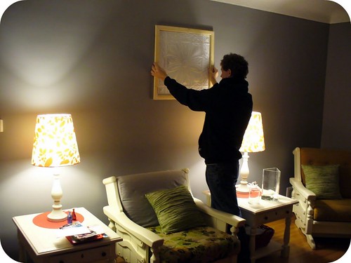
N finished making one frame for the ceiling tiles that we are going to hang in the living room. The frame is exactly what we wanted and now all that's left to do is paint it. Now that we just have that one step left - we can't decide on a paint colour.
What do you think? Please leave your opinions in the comment section. Thanks! :-)
Options: Dark grey, white, heirloom white (off-white) or another colour
The walls in the room are painted a medium grey colour. The furniture is painted heirloom white (off-white). The room is accented with red (eventually we are going to make red cushion covers) and robin's egg blue.
Here is a photo of the room and where the frames will be hung.
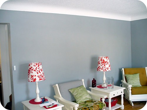
This gives you a better idea of the colours in the room.
The tile is white so I think it might look weird with the frame painted heirloom white (off-white). I think that it would look funny if the frame is painted white because the furniture, curtains and 2 other art pieces are all off-white, not white. My other thought was painting the frame dark grey. But I wasn't sure if that would be too dark...? N thinks we should paint it heirloom white (off-white) but I'm not sure if that would look weird - an off-white frame around a white tile. The lampshades are white with red flowers. The green throw pillows won't be there much longer - I'm going to make new covers that are red, grey and blue.
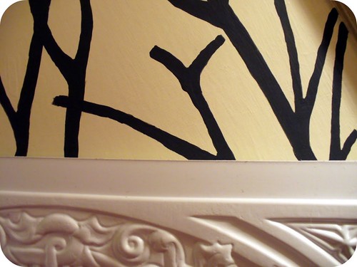
Here is the tile up against my tree painting - the background was done in heirloom white and the trees are the kind of dark grey I was thinking we could paint the frame.
So what do you think? Grey? Heirloom white? White? Another colour?
Thanks for the help!
My first reaction was green to match the pillows but if you're getting rid of those, probably not. Do you want people's attention to be drawn to the tiles? If yes, I think a muted red or blue would look nice. It would bring some color to the walls and pull from the other colors you'll be using. If you want them to blend and not be a focal point, I'd go with white. I'm not sure which one, though. You can always prime them and see how you feel at that point.
ReplyDeleteI think they would look great with dark grey against the medium grey!
ReplyDeleteI would do the dark grey that you used for the trees in the framed picture- that way I feel like it would tie the wall decor together a bit more. Otherwise, I would go for a bold color (like red, since that's a color you keep present in the room all year long).
ReplyDeleteI vote for dark grey
ReplyDeleteI think dark grey or red would look great.
ReplyDeleteI think it would look great if you used your accent colors!! Red or blue!! I'd say red, since I'm not too sure what shade of blue.
ReplyDeletegrey! :)
ReplyDelete